Curating art for the home is a very personal process and one of the last things I do when decorating a new space. I moved into my rental back in February and the decorating journey has been a long one to say the least. So far you can see my bedroom, bathroom, patio, and DIY cabinets and today I wanted to talk art.
Just like a handbag completes an outfit, art completes a room. When choosing there are a few things I consider:
- Vibe: What is the vibe of the room? Is it girly glam? Traditional? Contemporary? And what do you want to feel when you are in it? For example, I wanted my bedroom to be tranquil, so I chose things that were soothing and calming to look at. Putting a loud abstract would’ve been all wrong. Once you’ve determined your vibe, you need to think about the subject. Do you like landscapes? Abstracts? Cityscapes? Flowers?
- Wall Space: This is important in deciding if you are going to go with one larger piece, a smaller piece or a gallery wall. (Tip: When doing a gallery wall I recommend screen shotting some images and arranging them on your desktop to see how they look together before you purchase, that way you already know what works.)
- Color Scheme: If the overall color scheme of the room is muted you need to decide if you want it to stay that way, or if adding bold art will bring some life to the space. When decorating, you want to choose no more than 3 colors to bring into the room, and you need one item with all three colors to tie it all together. I like to use my art to do this.
- Medium: Some spaces look better with painted canvas or prints, some look good with photography. Depending on the space, it is perfectly acceptable to do a combination of both.
- Framing: This is extremely important because it determines how the art fits seamlessly into the space. It can also change the entire vibe of the piece. You need to consider color and texture and how it relates to both the room and the art itself.
For me, I turned to Minted to find the art I was looking for because it my absolute favorite. I wanted a large bolder piece for my living room and a gallery wall for my office/beauty room. Both rooms have very different vibes and Minted has a HUGE selection of all subjects, mediums and sizes. They also have a wide variety of frame options that you can ‘try on’ the piece you are considering.
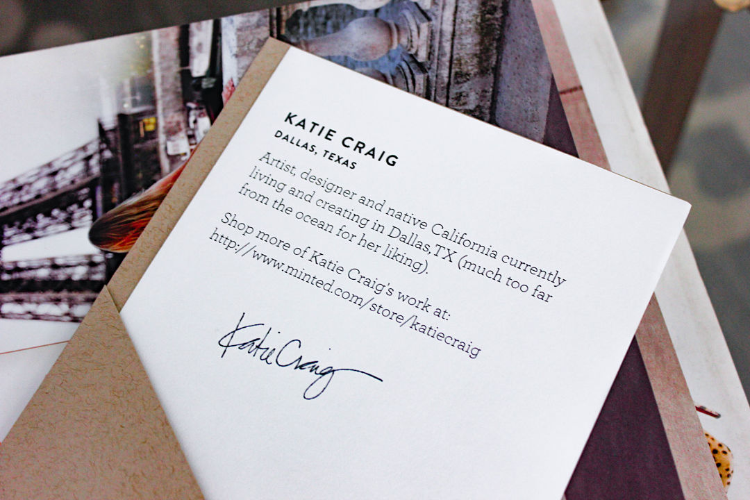
All of the art on Minted is created by independent artists themselves and if you find something you like you can click on that artist to see what other things they have created. So let’s get onto what I got shall we?
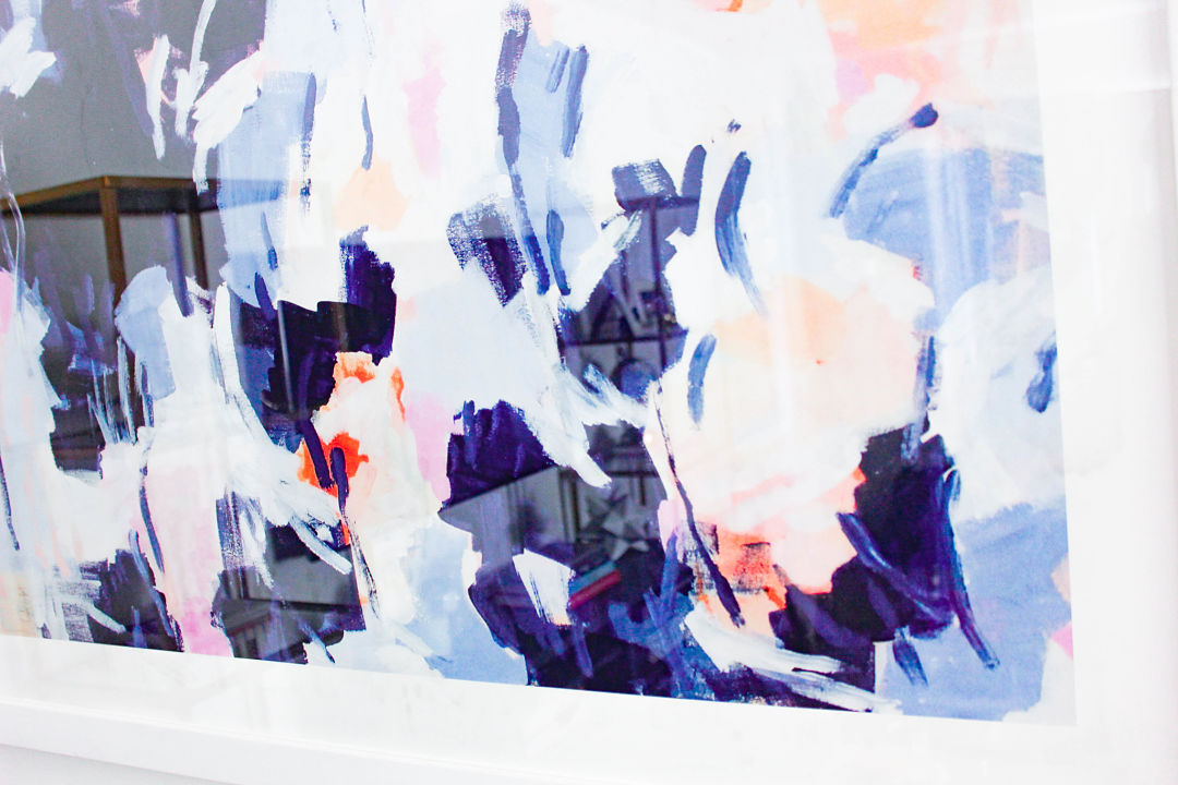
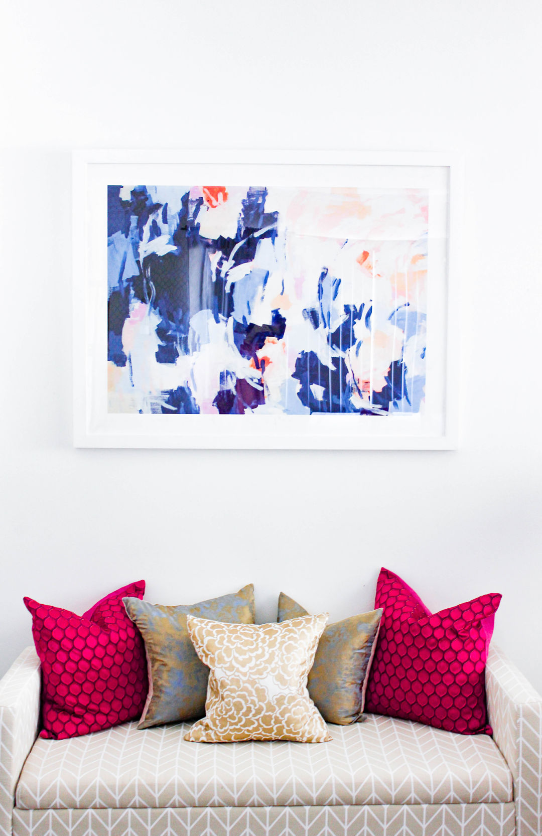
In the living room, the vibe is feminine glam with a touch of contemporary. I wanted something vibrant, bold, yet pretty and feminine. The wall is large and can really handle a large piece and I wanted something bright because what I had there before was dark. I decided on abstract because it plays to the contemporary, but I needed to find a piece that spoke to the feminine glam as well (this isn’t easy to do!) When I stumbled upon this print from artist Katie Craig I was smitten. The color scheme in the room is blue, pink and gray so this just fit perfect and it really embodies the vibe.
It should be noted that this painting came as a portrait orientation and I envisioned it as landscape so I moved the hanging wire on the back. Art is personal and it’s ok to make your own!
I will be doing an entire room reveal of this space after the new year (just waiting on the drapery) so you will be able to better see how this art works in the space. Stay tuned for that!
Artwork: Blousy Art Print by Katie Craig ; Bench: Hayneedle; Pillows: Motif
My office/ beauty room has an even more feminine vibe than the rest of the house. This is a place I just let all my girliness out. It is where I spend so much of my time not only at my desk working, but creating so much of the content for this site as well as filming most of my videos for youtube. It’s for this reason that the room be a place where I feel inspired.
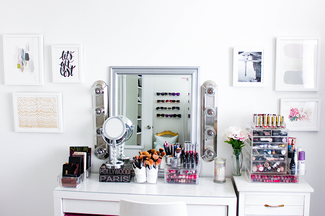
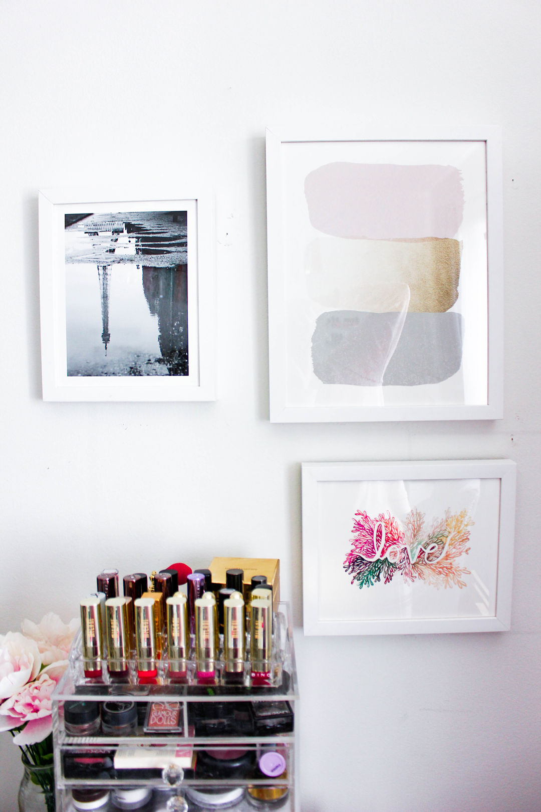
My vanity wall is awkward because there is not a lot of space on either side, but a ton of space above so it really looked blank, like it was missing something. I opted to do a gallery wall here on either side in order to create some balance. The color scheme of the room is white with pops of color so I decided to keep that going with the art. I used a mix of paint, drawing and photography and played with the arrangement and sizes.
I really love how it came out and it is as inspiring to look at as I hoped it would be!
Artwork: (from left to right) Weathered by Melanie Severin; Let’s Get Lost by Sam Dubeau; The Rapids by Rose Lindo
Artwork: (From left to right) Eiffel Tower in the Rain by Julie Wan; Reach by Carrie ONeal; Love by Kelly Ventura
I highly recommend checking out Minted for your art. There really is something for everyone and you will not be disappointed!
XO,

